Graphical Epiphany applied
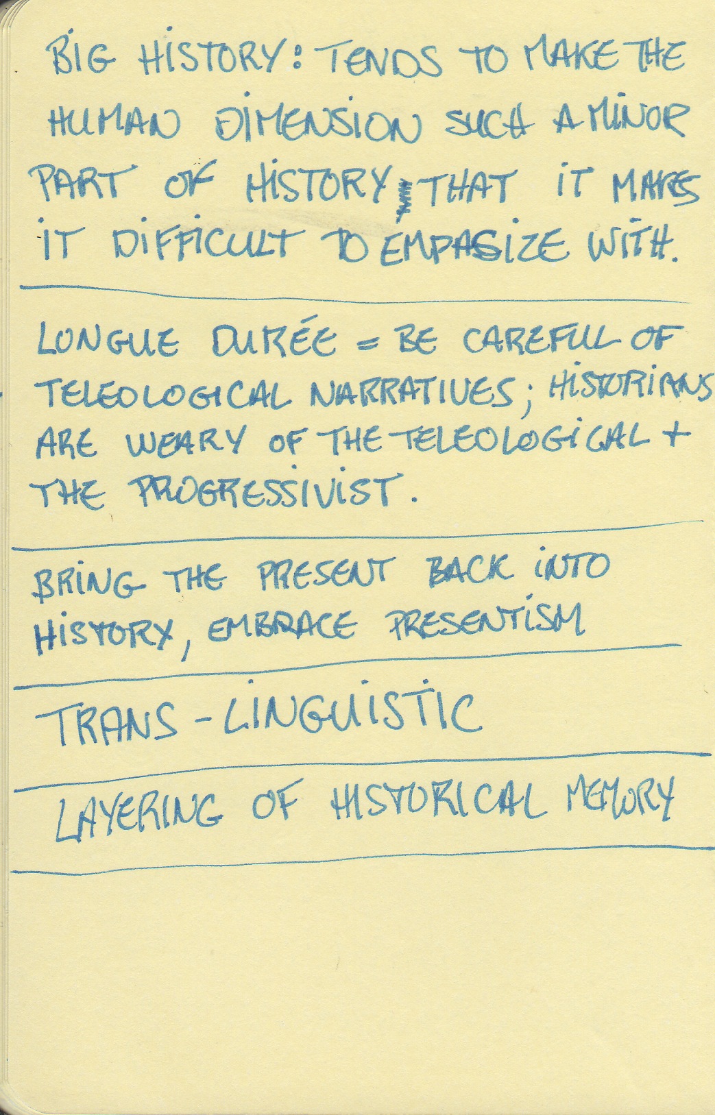
So I've been thinking a lot* about using a more graphical approach to my slide presentations and seminar discussion prompts. As the previous blog entry showed, I had a sort of epiphany about this a few days ago. Yesterday, I went to a Departmental Seminar series conference where I tried taking sketchnotes (sorta). The conference was not as interesting as I had hoped. I was expecting a presentation of three relatively new concepts in academic history (big history, deep history and history of the Anthropocene) and instead got a manifesto for the return to the longue durée. Since I never gave up on the longue durée, it was not as useful as I had wanted. But I took notes. I had issues with my pen, and I killed the English language in places, but I took notes!


Then I thought about trying to work more on my Sketchplanations-inspired discussion prompts. What is interesting about what Jono Hey is doing is that he takes one idea, one concept, or one set of info and distills it all into one graphic or a three to four set of graphics. That is a spectacularly difficult thing to do, I find. He has done hundreds by now and he was a UX guy long before that, so graphics are not a foreign language to him. I am a wordsmith by nature, so thinking in images is much harder for me. Words come out easily. Images come out with some difficulty. The more so that I am not used to doing it much. I'm getting better. I still kill English, but I'm better.

Very basic anthropological concept discussion prompt ('shoped)
*Yes, this means thinking about this rather than marking or writing the things that have deadlines, I know.